Spacing
This guide outlines spacing guidelines to be applied across all products. Even though there are no hard rules when it to spacing, there are still best practices that are widely recognized by the UI/UX community and have proven to ensure a sense of consistency and ease of readability for the human eye. It is recommended to follow these best practices and only deviate from them when there is a strong reason to do so.
Principle of Proximity
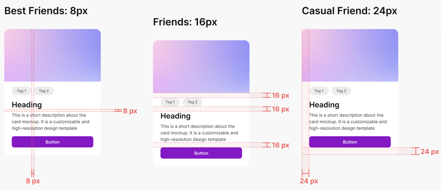
The foundational concept that should govern the spacing of every design is the principle of proximity. This principle suggests that when elements are positioned close together, we perceive them as belonging to the same group. Conversely, we categorize elements into separate and distinct groups when they’re far apart. You should use this natural intuition to guide users through the interface by grouping related elements tightly and adding more space between elements that serve different purposes.
rem values should be preferred over px values for spacing to ensure scalability and accessibility (even though in the screenshots px values are used)
Choosing Spacing Options
To define appropriate spacing between elements, it’s common and recommended to use the rem unit. One rem equals the font size defined on the root HTML element, which most browsers set to 16px by default.
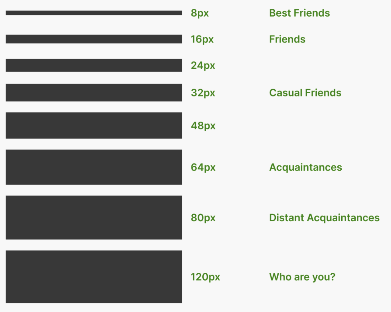
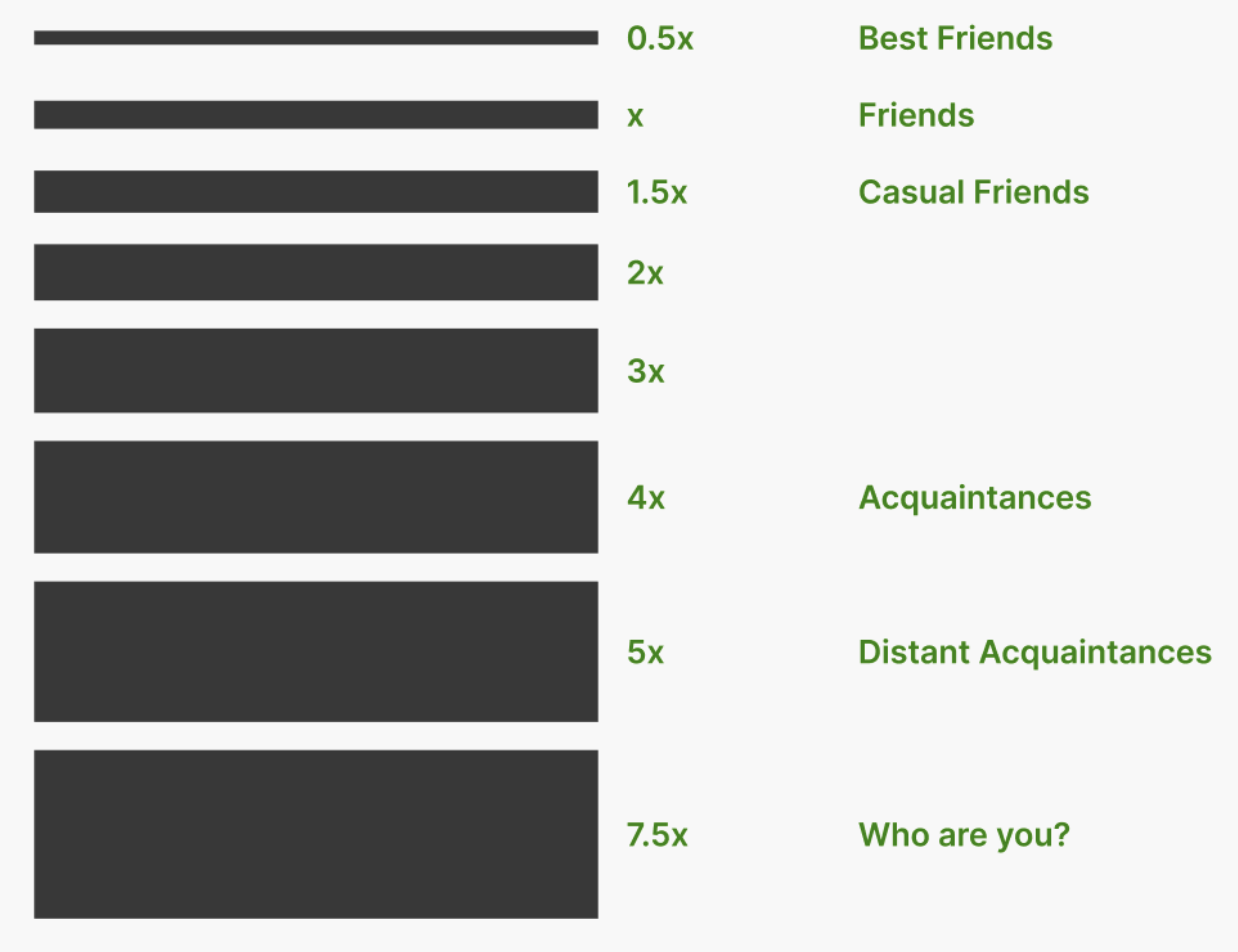
A typical practice is to choose spacing values by multiplying your base unit X (usually set as 1rem) by whole or half-unit increments. These spacing options can then be used to implement the principle of proximity.
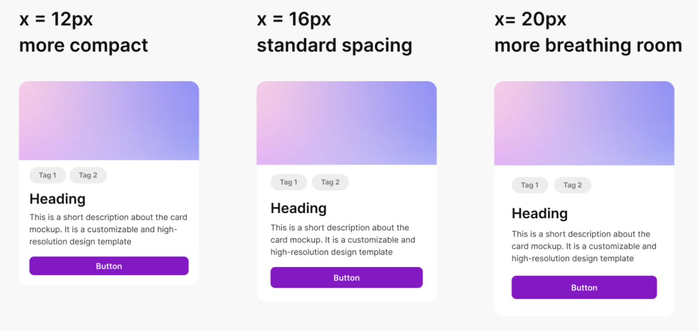
Controlling Compactness
To control how compact or spacious your design feels, the base unit can be fine-tuned to be between about 0.75 and 1.25 times the size of 1rem. This allows you to create more breathing room or conserve space as needed.