General Conventions
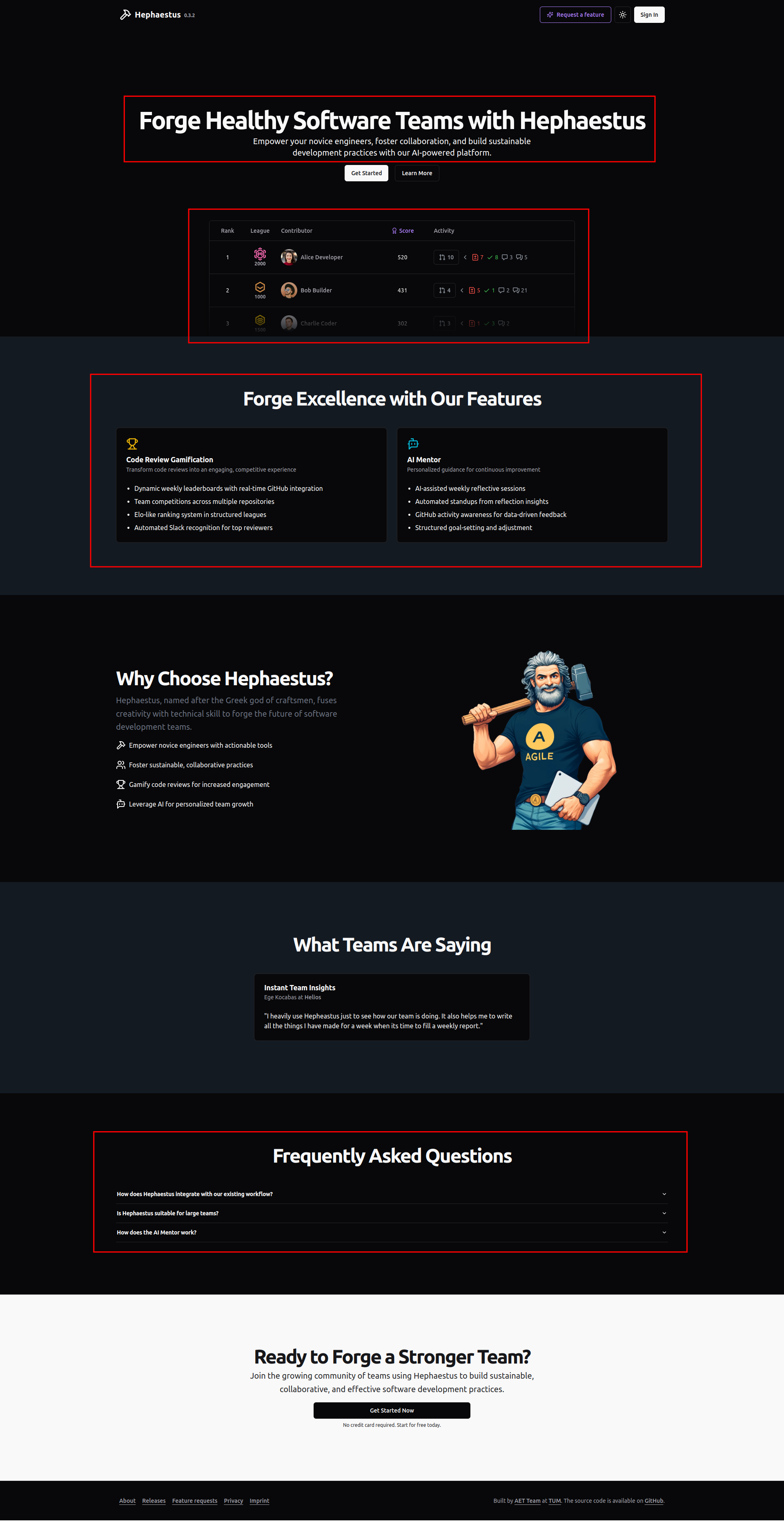
🏠 Landing Page
- Features & FAQs should be prominently displayed to help new users understand what the app is used for
- The Login button should be highly visible for quick access.
- Most features should be accessible before requiring login (avoid an early login wall).
Example
Header Design
- Should include (in this order):
- App Name + Version Number
- Dark Mode Toggle 🌙/☀️
- Login Button
- Should be max. 3.75rem in height.
- Should make use of the primary color theme.
Example

Footer Design
- Should include:
- "Built by" attribution 👨💻
- About & Legal pages 📜
- Commit Sha and version of deployed app
- Bug report / feature request link 🐞
- Non-sticky: The footer should not remain fixed while scrolling.
Example

📂 Project/Course Page
- Projects/Courses should be displayed as cards instead of a list for better visual clarity. The cards should include the title of the project/course as well as most relevant information about the project/course
- No sidebar should be used on the main project/course page.
Example

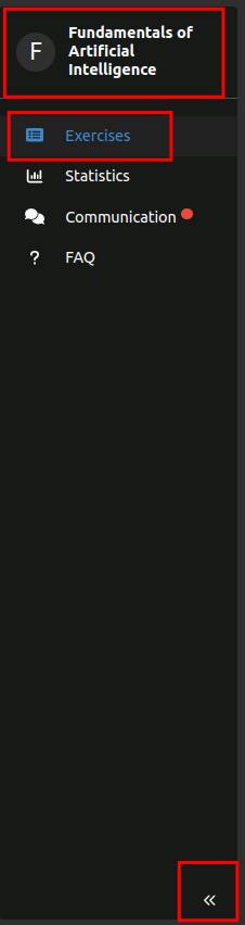
⏩ Sidebar Navigation
- Project context should be displayed at the top of the sidebar, which can be used to quickly switch projects.
- The other items should only be used for switching different in-project contexts but not for switching between projects.
- Project settings should be placed at the bottom of the sidebar with a divider above.
- Items in the sidebar should contain an icon and a short text
- Sidebar should be collapsible & expandable via a prominent chevron icon.
- Should make use of the primary color theme or be at least visually highlighted.
- On mobile devices:
- there should be a sidebar icon or burger menu icon on the far left of the header to expand the sidebar.
- the sidebar should be hidden by default.
Example

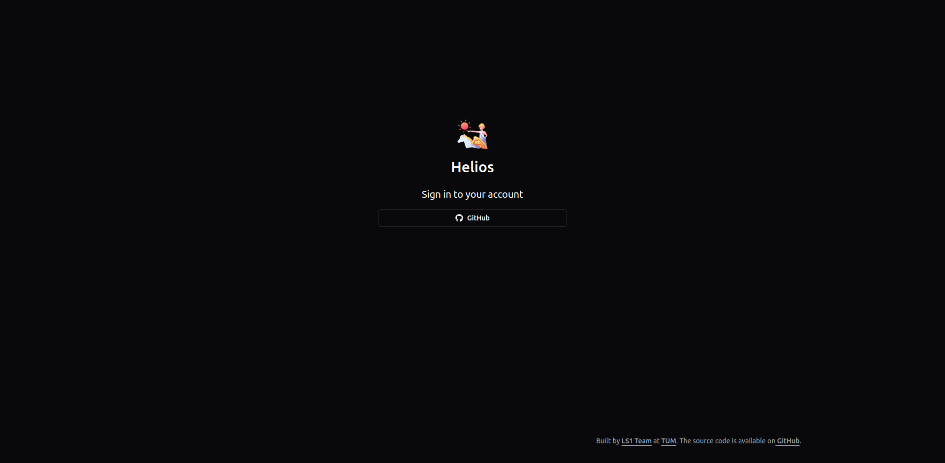
🔐 Authentication
- If Keycloak is used, the Keycloakify theme should be applied for a unified login experience for all AET apps.
Example
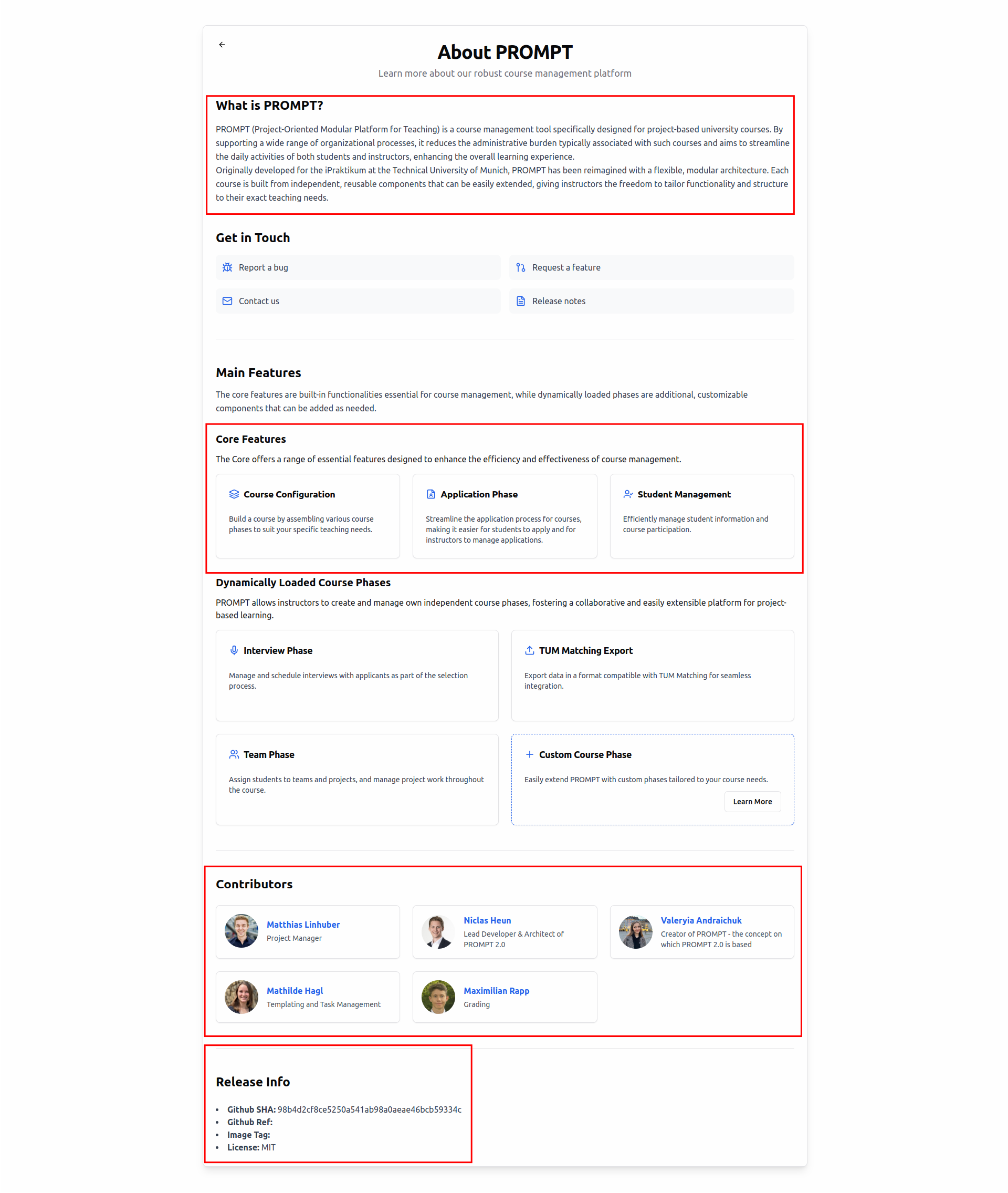
ℹ️ About Page
- Should include:
- 📸 Features with screenshots for clarity.
- 🤝 Contributor information to acknowledge contributions.
- 🛠️ Developer details such as version number, GitHub SHA etc.
Thanks for following these recommendations, with that we ensure a modern, accessible, and user-friendly experience for AET web applications! 🚀
Example
Color Theme
We provide a sample theme config file for primeng.
It uses a similar color theme as the main TUM website. Please use - if possible - only the provided colors on the page. The supplied file is amending the Aura preset from PrimeNG.
Further Ideas to Improve UI Design@AET
- Add keycloakify project for AET that is included by different projects
- Add boilerplate html code for Imprint etc.
- Add color theme for AET following the TUM theme
- Agree on a single icon library for all projects (e.g. tabler)